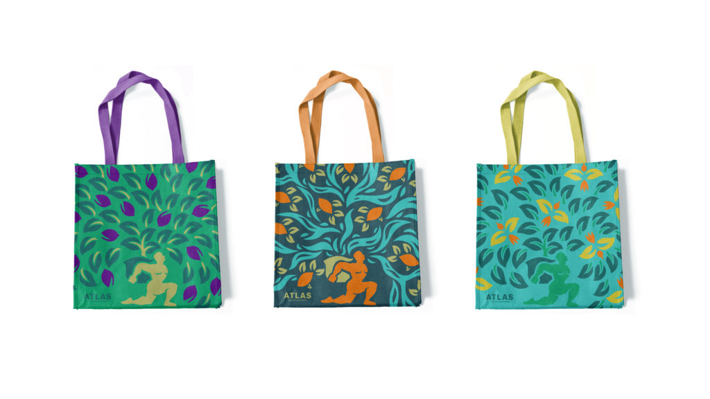
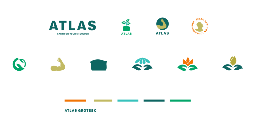
Atlas was an interesting design challenge in that I had to take a story from mythology that had been used over and over again and give it a unique and temporary twist to pull it from the realm of cliche to inviting and interesting, yet still have it be relevant to what the company stands for. Atlas is a reusable bag company, so I focused on sustainability with Altas carrying the possibility or regrowth and a fresh start on his back. The stylization of Atlas hearkens back to art nouveau 2D art forms. The mix of stylization mixed with the bright colors of the brand make this company stand out on the shelf and far from cliche.
Brand Positioning
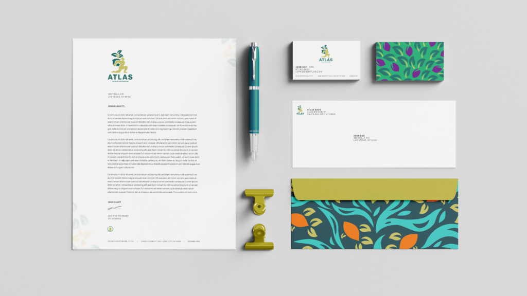
Atlas is a sustainably designed reusable bag, produced to replace plastic retail bags. It’s unique in the industry in that it has strong retail design appeal. As a company, Atlas cares about the three “Ps” of Sustainability: people, profit and planet. Atlas wants to be perceived by its stakeholders as human-centered, desirable, contemporary, cool/hip/fun and earth-friendly.